Redesign a corporate education application to increase user engagement
My Role
UX/UI Designer
Team
UI Designer
Product Manager
Frontend Developer
Main Skills
UX Research, Persona Development, User Journey Mapping, Heuristic Evaluation, Visual Design, Color Psychology, Gamification, Habit-Forming Design, UI Design, Andragogy Application, Feature Ideation, User Testing.
The Basics
Getting to know the challenge
The "Indica" application is a corporate education application where the company can release educational content so that its employees can learn more about the subjects pertinent to their position and, thus, always keep up to date with the market, ensuring better service.
Lately, the company was noticing a low level of engagement with its users, regardless of the client analyzed, generating few uses of the platform and little interaction with the content sent to these employees, generating problems in business metrics and existing commercial partnerships with its clients.
Research
Investigation and Design Process
To find out what was causing the low user engagement and also how we could create new features that would cause habits in the collaborators that consumed the content made available by the application, the project was divided into four main parts: market understanding, user understanding, andragogy, and psychology rules understanding, and materialization of these learnings in new screens and functionalities for the application.
Research
User Research
Conduct quantitative and qualitative research to fully understand users, including their characteristics, pain points, and needs.
Research
Personas & Journeys
Develop personas and user journeys to map who the users are and how they interact with the application in their daily routines.
Research
Heuristic Evaluation
Perform a heuristic evaluation to identify usability issues in the current platform that affect user engagement and retention.
Research
Andragogy & Colorimetry Studies
Apply andragogy principles to integrate psychology techniques into employee-facing content and use colorimetry to ensure effective color usage in learning environments.
Insights
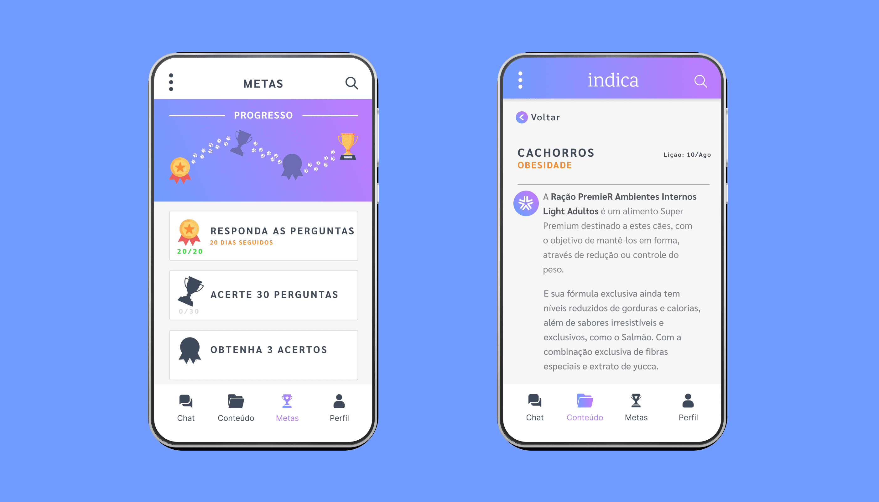
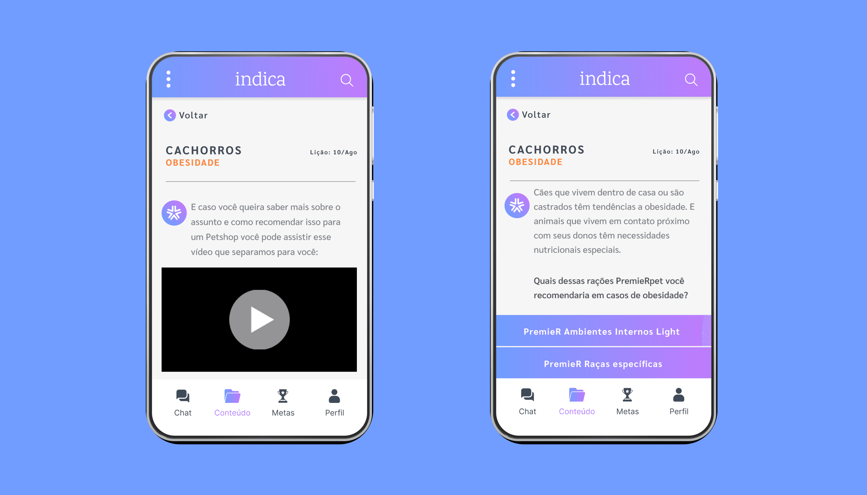
Product redefinition, with the development of new habit-creating features
One of the engagement problems encountered with users was that the app contained only a feature, which prevented users from engaging more with the app since they needed help to use the product in their day-to-day work.
For this reason, it was not enough to just redesign the platform but to create functionality and a user journey that made sense in the context of their usage. To do this, we introduced features based on psychological techniques such as gamification and andragogy so that our users would create a habit of use according to their needs.
At the end of the research process, we increased our users' journey, allowing them to come back to the app for new uses, and we also created new features that made sense with their daily work life, bringing more purpose and meaning to the use of the digital product.
Solution
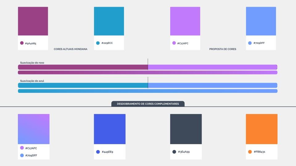
Studies and application of a new colorimetry to change user perception and use
Another point of discussion discovered through the in-depth research with users was the visual aspect that the application had, which resulted in a distancing of users and little involvement from them with the solution, leaving the relationship more formal than it should be officially.
To solve this problem, besides redesigning the visual solution of the application, a colorimetric study was also carried out, applying color smoothing and applying knowledge of color theory to propose a new environment for the application, increasing the engagement of users and inducing them to a new habit of creative and educational use.
Solution
Design of the final application solution, validated with users and with the application of best practices discovered in the immersion process
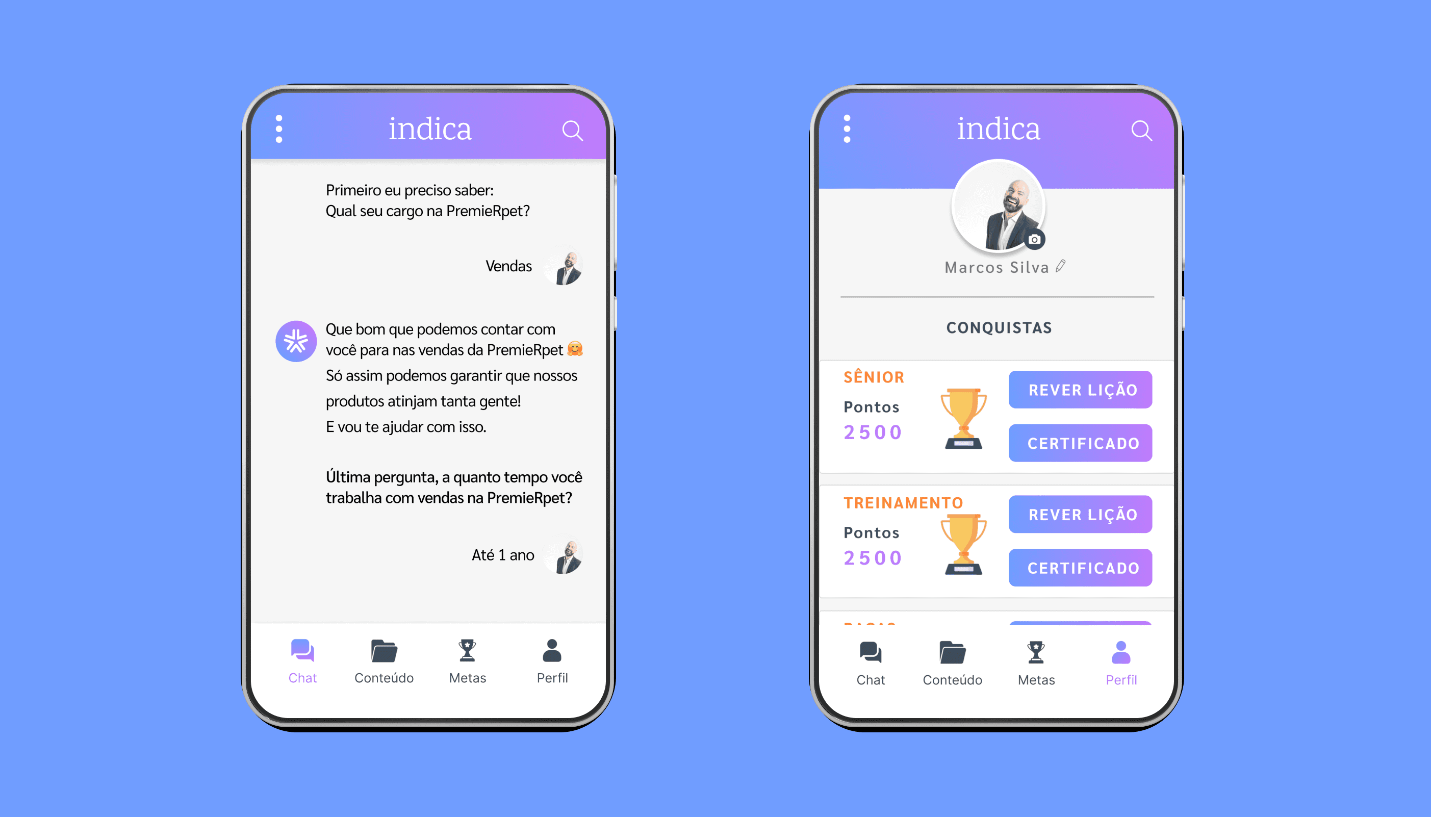
After the process of research, immersion, and market study, it was possible to draw a vision of the evolution and design of the final application with its new journey, features, and screens. Then, it was possible to know the appropriate journey for the users.
To ensure that the solution delivered was the most coherent with our users' scenario, we first created a low-fidelity solution and then made medium and high-fidelity solutions. In each stage of creating fidelity levels, we talked with the users, understood the possible points of improvement, understood new paths, and evolved to the new set.
The final result was the development of a complete platform using existing components in the product's Design System, with adaptations and evolutions. The final design of the platform, with its functionalities and screens, was the closest to the ideal outcome, tested and validated with the users, which would be implemented in stages, with data monitoring and feedback collection from users as they started using it.


Next Project
From foundation to success: creation, organisation, monitoring and success of the Design Ops team
A story about my experience working in the creation, structuring, and development of a multidisciplinary Design Ops team with a broad scope of action.

Let's work together?
Let’s build, learn, and create something meaningful together
Let's work together?
Let’s build, learn, and create something meaningful together
Oops!
My portfolio isn’t available on mobile just yet
For the best experience, please visit on a desktop.

As a little thank-you for your patience, here’s a cute dog gif
Oops!
My portfolio isn’t available on mobile just yet
For the best experience, please visit on a desktop.
As a little thank-you for your patience, here’s a cute dog gif